To create a vibrant and bold home palette, it is important to have a basic understanding of color theory. This includes knowledge of primary, secondary, and tertiary colors, as well as color combinations and harmonies. Primary colors, such as red, blue, and yellow, are the building blocks of all other colors and cannot be created by mixing other colors. Secondary colors, such as green, orange, and purple, are created by mixing two primary colors together. Tertiary colors are created by mixing a primary color with a secondary color, resulting in colors such as blue-green and red-orange. Understanding these color categories is essential when creating a cohesive color palette.
Color combinations and harmonies are also important to consider when designing a home palette. A color scheme can be monochromatic, using different shades of the same color, or it can be complementary, using colors that are opposite each other on the color wheel. Analogous color schemes use colors that are next to each other on the color wheel, while triadic schemes use three colors that are evenly spaced on the wheel. By understanding these different combinations and harmonies, homeowners can create a bold and cohesive color palette that reflects their personal style.
The psychology of color is another important aspect to consider when choosing a home palette. Different colors can evoke different emotions and moods, such as red being associated with passion and energy, while blue is often associated with calmness and serenity. Bright and bold colors, such as fuchsia and neon green, can create a high-energy and exciting atmosphere, while darker hues can create a sense of sophistication and elegance. By understanding the emotional influence of different colors, homeowners can create a home palette that not only looks beautiful but also feels welcoming and comfortable.
Exploring bold and vibrant color palettes for the home
The living room is often the heart of the home, and a bold and vibrant color palette can make it a lively and inviting space. From retro bookcases to modern artwork, there are many ways to incorporate color into a living room. By layering bold accent colors with neutral tones, a moody and modern living room can be created. In contrast, a sophisticated, botanical color palette can be achieved with rich reds and modern taupes. Whether you prefer bright and bold or soft and subtle, there are endless possibilities for creating a colorful living room that reflects your personal style.
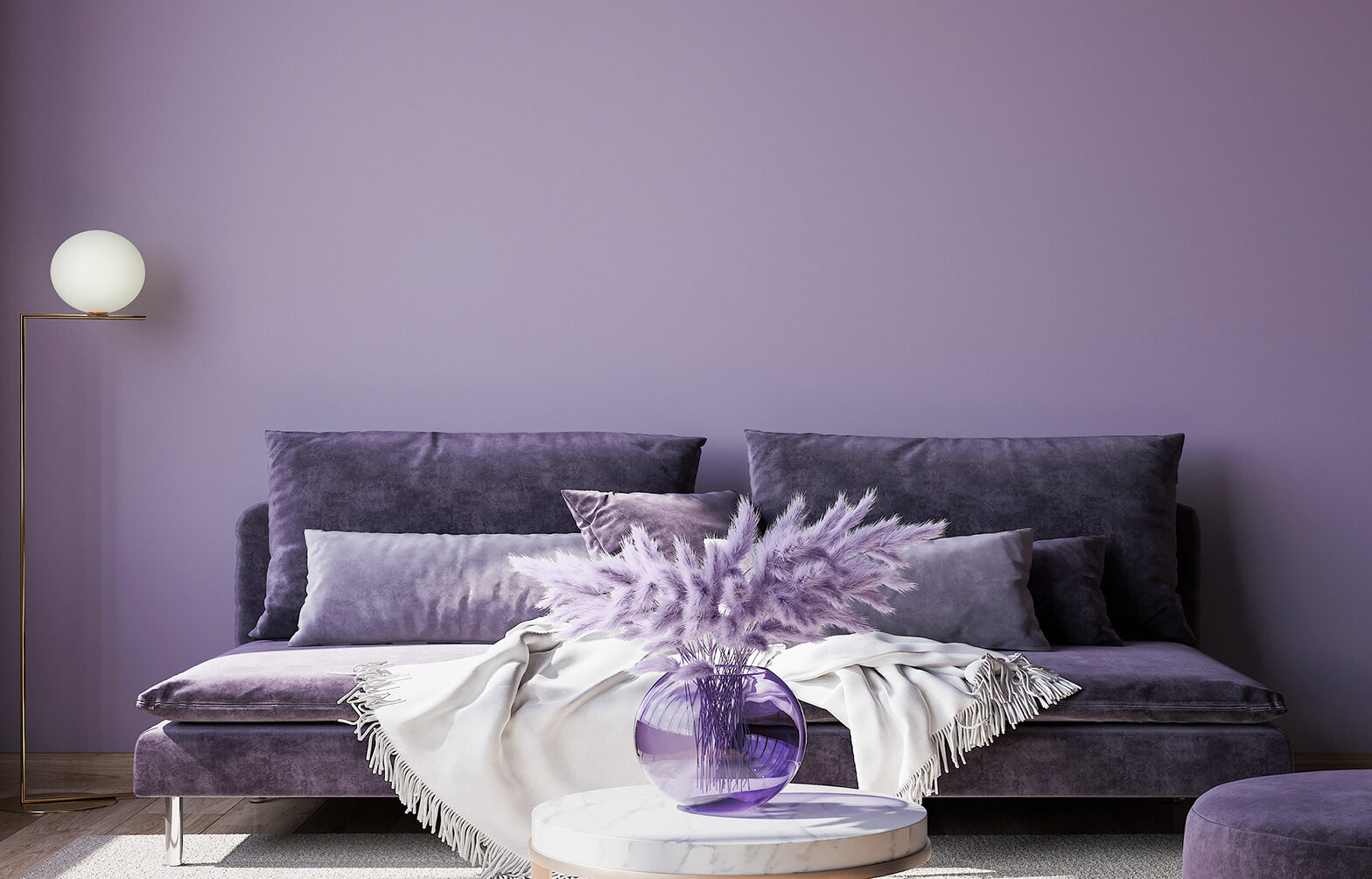
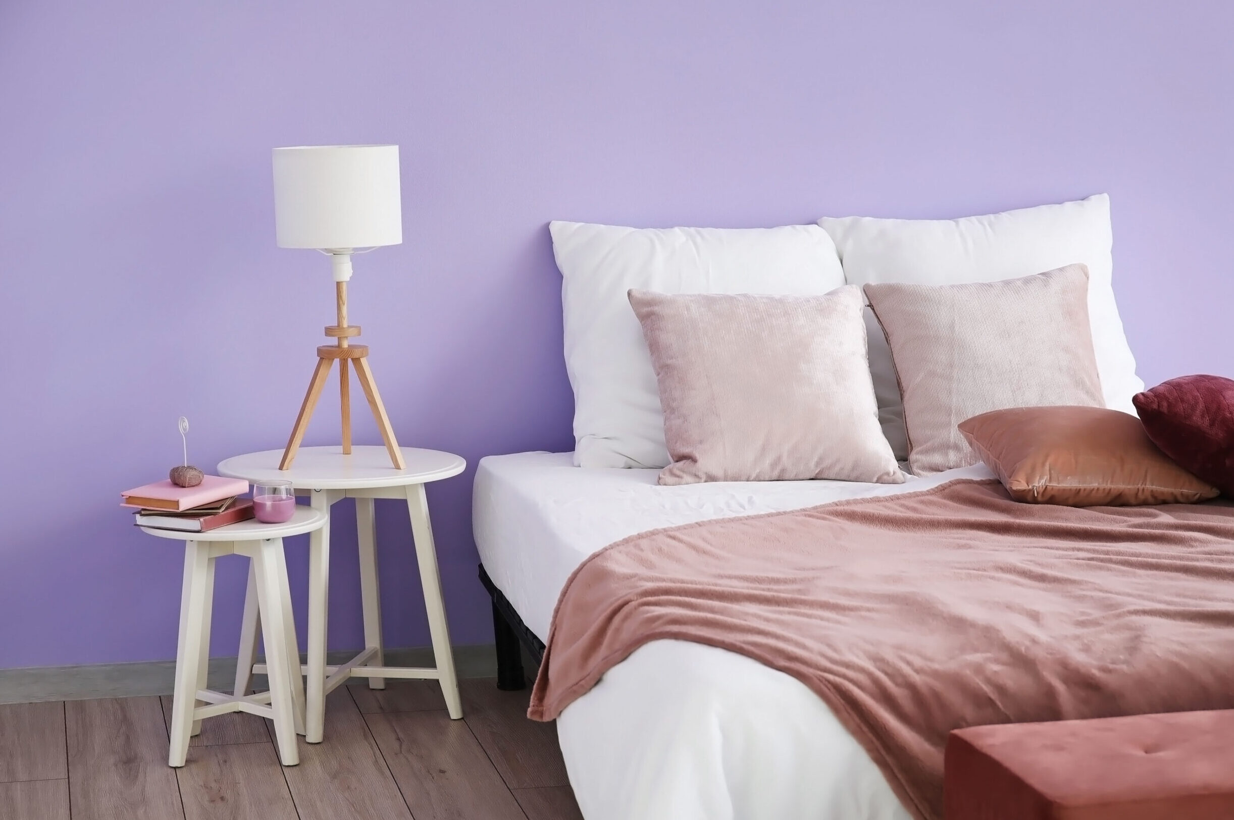
Bedrooms are a place for rest and relaxation, but that doesn’t mean they have to be boring. Bold shades can enliven a bedroom and create a cozy, intimate atmosphere. From calm and quiet to bold and vibrant, there are a variety of color schemes to suit different tastes and moods. Whether you choose to paint the walls a bright shade or incorporate colorful accents through bedding and decor, a colorful bedroom can be a refreshing change from traditional neutral tones.
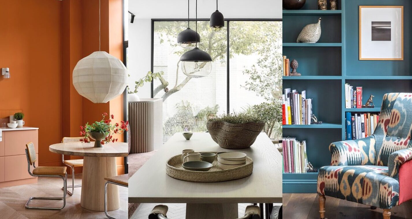
Kitchens and dining rooms are often the hub of social activity in a home, and a colorful palette can make them even more inviting. From playful and energetic to serene and calming, there are many ways to incorporate color into these spaces. This year’s color trends include impactful pinks and rich reds, as well as earthy, grounding neutrals. Whether you choose to paint the walls, add colorful accents through textiles and decor, or incorporate colorful appliances and fixtures, a colorful kitchen and dining room can create a warm and welcoming atmosphere for family and guests.
Tips for incorporating bold and vibrant colors into home decor
Incorporating bold and vibrant colors into home decor can be an exciting way to add character and personality to any space. One way to incorporate bold colors is through accent walls and statement pieces. Whether it’s a painted accent wall or a bold piece of furniture, adding a pop of color can create a focal point in a room. Another way to add color is through layering different colors and textures. This can be achieved through the use of throw pillows, rugs, and curtains, which can add depth and dimension to a space.
It is important to balance bold colors with neutral tones to avoid overwhelming a space. Neutral colors can help ground a room and provide a calming effect. When incorporating bold colors, it’s important to be mindful of balancing them with more subtle, neutral tones. Additionally, incorporating different textures and patterns can add visual interest and balance out the use of bold colors.
When exploring the world of bold and vibrant colors, it’s important to stay up-to-date on the latest color trends. For example, Pantone’s 2022 Color of the Year is Very Peri, a strong and exuberant color that celebrates being bold and courageous. This year’s color trends also explore everything from earthy, grounding neutrals to impactful pinks and rich reds. By staying informed on the latest trends and being mindful of balancing bold colors with neutral tones, anyone can create a vibrant and bold home palette that reflects their unique style and personality.