

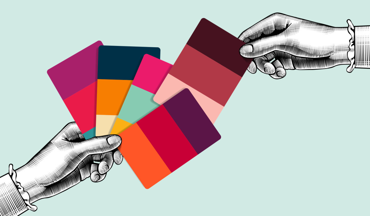
Color is a powerful tool that can greatly impact design and everyday life. When choosing colors for a space, it is important to find a balance and consider where the colors will be introduced. Typically, it is suggested to use accents such as furniture, rugs, pillows, art, and accessories to incorporate color into a space. Understanding the importance of color is the first step in creating a visually appealing and impactful design. Novice designers can start by learning the basics of color theory, types of color schemes, and the use of palettes.
The psychology of color is a fascinating subject that explores how humans perceive color and the subliminal messages it communicates. Color theory is both a science and an art that explains how different colors can evoke different emotions and behaviors. In branding and marketing, color plays a critical role in conveying a brand’s message and personality. Specific colors can be linked to behaviors, and businesses can use this knowledge to make better decisions when choosing colors for their brand. For example, red is often used in marketing because it is bold and captures attention, while blue is associated with trust and reliability. A color wheel or palette generator can help businesses find colors that match their brand aesthetic or the style they are trying to emulate.
In conclusion, understanding the power of color is essential in creating impactful designs and marketing strategies. Whether it’s choosing colors for a space or a brand, understanding the psychology of color and its impact on emotions and behaviors can greatly enhance the effectiveness of the design or marketing message. By learning the meanings and importance of various colors, designers and marketers can make informed decisions that will help them achieve their desired outcomes.
Exploring bold and bright color palettes
Bold and bright color palettes are becoming increasingly popular in home design and fashion. Homeowners are embracing candy-coated bolds and vibrant pastels, as seen in collections such as the Bold Simplicity Color Collection. According to the 2023 Home Design Predictions by Houzz, homeowners are shifting towards bright and bold colors in their interior design choices. Design experts suggest that bold colors can radiate modernism and drama, transforming a space into a statement piece. By incorporating vibrant and bold colors into one’s home or wardrobe, individuals can add a pop of personality and energy to their surroundings.

Complementary color schemes, which involve pairing colors that are opposite each other on the color wheel, can create a bold and striking effect. For example, the combination of red and yellow creates a cheerful and vibrant atmosphere. Split complementary color schemes involve using one dominant color and the two colors adjacent to its complement. This creates a visually interesting and balanced palette. Triadic color schemes use three colors that are equidistant from each other on the color wheel, such as royal blue, peach, and yellow. By experimenting with different color schemes, individuals can create unique and bold palettes that reflect their personal style.
Analogous color schemes involve using colors that are next to each other on the color wheel and can create a harmonious and cohesive look. These combinations work well for creating a subtle and sophisticated atmosphere. By using different shades and tones of the same color, individuals can add depth and interest to their design choices. Creating a unique color palette is essential for any design project, whether it be for logos, illustrations, or home decor. By exploring bold and beautiful color choices, individuals can add personality and energy to their surroundings, creating a vibrant and dynamic atmosphere.
The use of pastels in design
Pastel colors have become increasingly popular in design, offering a soft and subtle alternative to bright and bold hues. Pastels are typically described as “soft,” “washed out,” or “pale,” and can evoke feelings of calmness and serenity. Pastel color palettes can bring a new vibe to visual communication, simultaneously calming and energetic. Baby blue, mint green, lavender, peach, pale pink, light yellow, soft coral, and light gray are just a few examples of popular pastel colors. Pastels are versatile and can be used in a variety of applications, from fashion and home decor to graphic design and branding.
Pastel colors are often combined to create unique and beautiful color combinations. Mint green, baby blue, and pale pink, for example, look great when mixed together. Pink and blue is another popular pastel color combination, with pink often having a softer, spring-like pastel aesthetic and blue having hints of maturity. Once a color palette has been decided upon, it can be mixed and blended to create new hues and variations, including beautiful unified grays. Designers are constantly exploring new and creative ways to use pastel colors in their work, making pastel color trends an exciting area to watch.
Pastel colors have been a popular trend in fashion and design for several years now, with no signs of slowing down. Pastels have been used in everything from clothing and accessories to home decor and graphic design. The pale blues in the logo of a brand or business can be the most prominent and attention-grabbing of all the pastel colors used. Pastel color trends are constantly evolving, with new combinations and applications being explored all the time. Whether you’re looking to create a soft and dreamy vibe or a bold and beautiful statement, pastel colors offer a versatile and exciting option for any design project.
The timeless elegance of black and white
Black and white is a classic color combination that has stood the test of time. This elegant pairing creates a timeless and sophisticated look that can be used in a variety of design contexts. The use of black and white in design can be traced back to the Art Deco movement of the 1920s and 1930s, where it was used to create bold and striking visuals. Today, black and white is still a popular choice for designers, and it is often used in modern design to create a minimalist and sleek look.
In recent years, there has been a resurgence of interest in black and white design trends. From fashion to interior design, black and white is being used in new and exciting ways. In 2023, interior design trends are expected to feature bold black and white patterns and graphic prints. Additionally, the use of black and white in logos and branding is becoming increasingly popular, as it can create a strong and memorable visual identity.
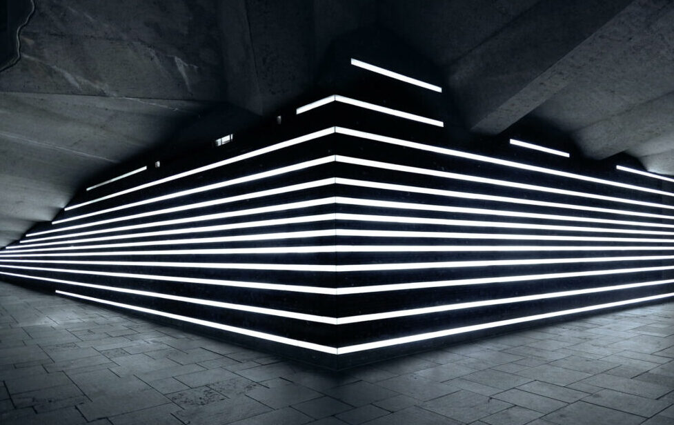
Black and white is not just limited to design; it is also an important element in photography. Black and white photography is a timeless art form that has been used by photographers for over a century. The use of black and white in photography can create striking and dramatic images that capture the essence of a subject in a way that color photography cannot. Whether it’s in design or photography, black and white will always remain a classic and elegant color combination that is sure to make a bold statement.
Tips for using bold and beautiful palettes in your own designs
When it comes to using bold and beautiful palettes in design, it is essential to understand color theory and how different colors work together. Color theory involves organizing colors on a color wheel and grouping them into primary, secondary, and tertiary categories. By understanding the relationships between colors on the color wheel, designers can create effective color schemes for their projects. It is crucial to select colors that complement each other and reflect the desired mood or message of the design. By using color theory as a guide, designers can create visually appealing and impactful designs.
When working with bold colors, it is important to balance them with neutral tones to avoid overwhelming the design. Neutral tones, such as white, gray, and beige, can help create a sense of balance and provide a visual break from the bold colors. Additionally, incorporating darker tones, such as dark reds, greens, and blues, can add depth and mood to the design. By balancing bold colors with neutral tones and darker shades, designers can create a cohesive and visually appealing color palette.
To create a cohesive color palette, it is important to choose colors that complement each other and reflect the desired mood or message of the design. One way to achieve this is by using a triadic color scheme, which involves selecting three colors that are evenly spaced on the color wheel. Another option is to use a complementary color scheme, which involves selecting colors that are opposite each other on the color wheel. By following these guidelines, designers can create bold and beautiful color palettes that effectively communicate their intended message.